

**If anyone is here looking for an update on those peach buds Mrs Apple was talking about last week, she says we should give it another week to know for sure. So bear with us for another week of suspense.**
I have been trying to work on one room at a time. It allows me to really focus on the vision of the room and what I want it to look like. It gives me the time to mull over things and avoid impulse purchases.
Right now? It's the dining room.
So on St. Patty's day, I (unknowingly) got into the spirit of the day by painting our dining room green. Although, I would say it is more of a soft blue green - rather than straight green. The color is palladian blue by Benjamin Moore.
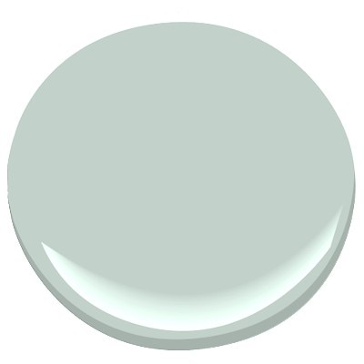 It looks so much bluer on the paint chip. Why does paint have to be so tricky? Because the world is a mysterious and dangerously confusing place. That's why. Beware.

I was hoping it would be a bit bluer than it actually is, but I am still really liking it. And of course it does read differently depending on the lighting. Like right now I am sitting here with no lights on and just the early morning light coming through the windows (which is not very bright since it is snowing outside - again.) and it is looking a lot more blue.
 I love the way that the color makes the molding in the room pop!
I considered going without curtains in here so as not to cover up the trim (that SS worked so very hard on). But I am glad I went for it. It just adds so much color and softness which I believe this room needs because the kitchen can read a bit hard and monochromatic.
 I bought the fabric from fabric.com on clearance and then used no-sew hem tape to make the curtains. I hung them with drapery clips from ikea. Super easy guys. I can post a tutorial if anyone is interested. The fabric is indoor/outdoor fabric. So next time spaghetti gets flung around the room and gets on the curtains I can just wipe it off easily. - or some other classy food flinging situation like that.
Next on the list for the dining room is a rug. Here are a few of the options I've been looking at (all from outdoorrugsonly.com).
 Although it doesn't really look it, all these rugs are a navy and white. I thought that these would tie in to the curtains nicely.
So on St. Patty's day, I (unknowingly) got into the spirit of the day by painting our dining room green. Although, I would say it is more of a soft blue green - rather than straight green. The color is palladian blue by Benjamin Moore.
I was hoping it would be a bit bluer than it actually is, but I am still really liking it. And of course it does read differently depending on the lighting. Like right now I am sitting here with no lights on and just the early morning light coming through the windows (which is not very bright since it is snowing outside - again.) and it is looking a lot more blue.
I considered going without curtains in here so as not to cover up the trim (that SS worked so very hard on). But I am glad I went for it. It just adds so much color and softness which I believe this room needs because the kitchen can read a bit hard and monochromatic.
Next on the list for the dining room is a rug. Here are a few of the options I've been looking at (all from outdoorrugsonly.com).
#3 was eliminated right off the bat from Michael since he says it looks too much like a beach towel - so there goes that. I am not really feeling the tight smaller stripes of #1. So that leaves #2 which was the one I liked best anyway. We are also choosing to go with an indoor/outdoor rug since it will be more durable and easier to clean if we get spills on it. That's what we did with the kitchen too and have been very happy with it.

We haven't pulled the trigger yet. I am having a hard time committing to the right size rug. So to help with that I took painters tape and measured out the rug size we were thinking:6x9. The great thing about this strategy is that we could live with the size for a while and see how it works. Ultimately we realized 6x9 was a bit small and, to scoot your chair out to leave the table, your chair would fall off the rug. Then you would have to pick up the chair to get it back on the rug and ain't nobody got time for that! So the picture below is measured out for a 8x10 rug, which looks like it will work much better.

And finally, once we decide on the rug and get it in place, I can make a final decision about the door color. I know for sure that it will be a shade of navy blue.
 The shade I'm looking at is called Van Deusen Blue by Benjamin Moore.
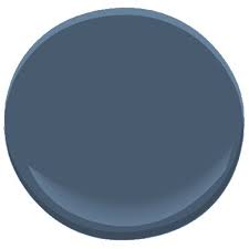 I think it will work well to tie in the curtains and the rug. But we will see when we get the rug in place.
We haven't pulled the trigger yet. I am having a hard time committing to the right size rug. So to help with that I took painters tape and measured out the rug size we were thinking:6x9. The great thing about this strategy is that we could live with the size for a while and see how it works. Ultimately we realized 6x9 was a bit small and, to scoot your chair out to leave the table, your chair would fall off the rug. Then you would have to pick up the chair to get it back on the rug and ain't nobody got time for that! So the picture below is measured out for a 8x10 rug, which looks like it will work much better.
And finally, once we decide on the rug and get it in place, I can make a final decision about the door color. I know for sure that it will be a shade of navy blue.
I also have plans for some artwork that I'm really excited to share with you guys and I eventually have plans to refinish the table to something like this:

All in good time. All in good time.
All in good time. All in good time.
How do you develope a vision for a room? How do you avoid buyers remorse? Painting any rooms lately?

Don't miss a beat.
{Follow this blog on Bloglovin'}
I love the color! It looks very fresh and spring-y...which we could all use more of right now. ;) The flowers in the chandelier are really sweet, too.
ReplyDeleteI was going to ask *you* how you come up with a vision for a room. Your rooms look so beautiful and pulled-together. I've started keeping a folder of ideas, but I'm not sure where one goes from there. Did you draw your plans up? Did it come together gradually as you went?